Skandia
Skandia helps its customers with loans, retirement planning, insurance, funds, stocks and all other aspects of banking. They no longer have visiting centers, instead they focus on optimizing their digital user experience.
My role and mission
As a UX and visual designer during my 2+ years at Skandia, my main projects were redesigning their app, doing a complete overhaul of ”My account” (where users log in to do their everyday banking) and making sure their digital presence was consistent through all touch points. I also worked on optimizing conversion flows for both private and business customers, goal management, conceptualization, user studies (in-depth interviews and user tests), information architecture, prototyping and visual design.
A few project summaries
App redesign
The goal of this project was to take Skandias visually and technically outdated app, keep most of its functionality and update it accordingly to what we had learned about the users needs and behaviors, and also updating its design language to make it cohesive with other touch points throughout the Skandia ecosystem.
My ambition was to make the app feel as Skandia as possible while maintaining a native app experience. Skandias brand typography and color palette worked quite beautifully married with iOS- and Android native UI-elements and UX.
Design system
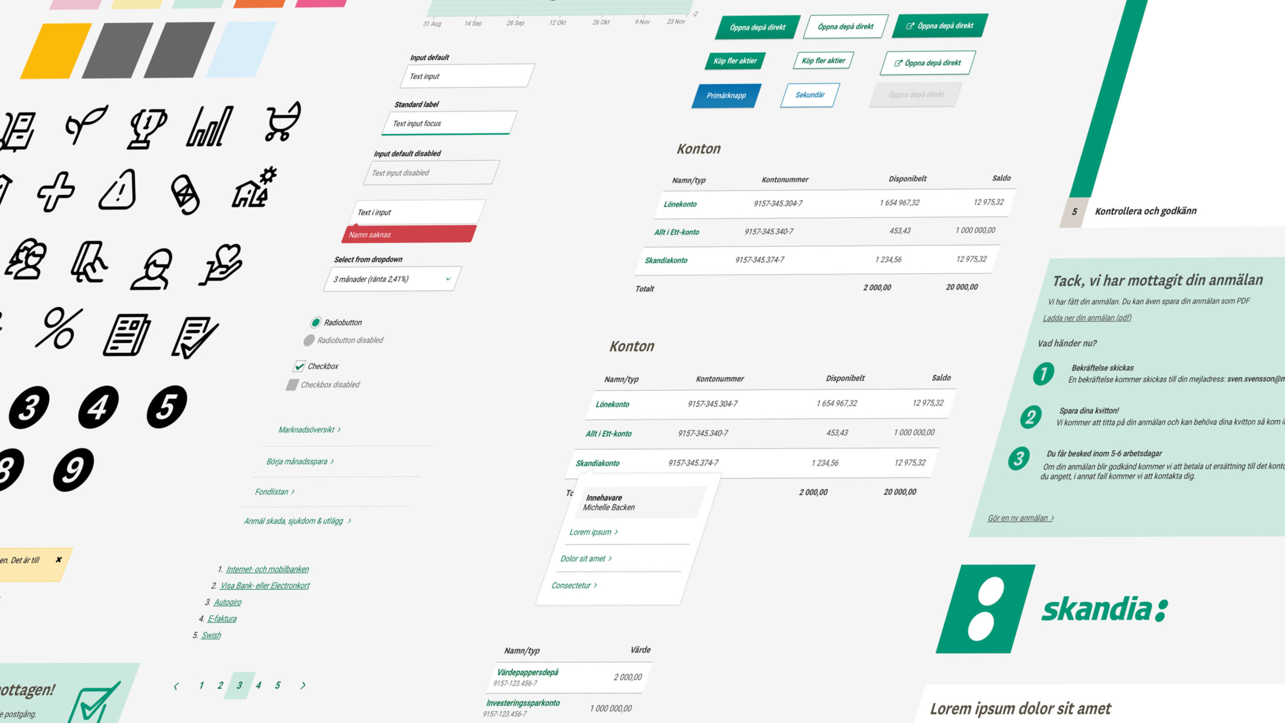
The Skandia brand was lacking a home for all its different parts - spread over different documents and resources. Through taking inventory and conducting workshops with the team I collected and further developed the brands digital identity. Skandia's design system enable rapid production of web prototypes and pixel-perfect designs. It creates a uniform, consistent whole regardless of device and designer. The Sketch symbols library further improve the consistency and make it convenient for new designers to easily get to work.
Digital banking
The goal of this project was to enhance the user experience of ”My account” (where users log in to take control of their their everyday banking) and to create a cohesive experience throughout the entire website, both logged in and the public website.
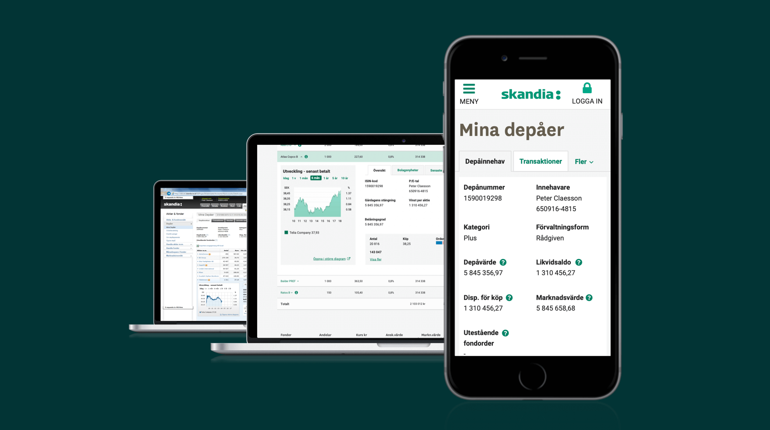
We had taken a non-responsive site full of tables, diagrams and other complex components and turned it in to a modern, fully responsive site. All this while guiding 20+ developers , synching with team members, making sure everything was complying with strict rules and regulations that comes with banking (MiFID, WCAG 2.0 AA, GDPR), keeping the stakeholders happy, and last but not least giving the users a superior user experience.


